This activity plan was prepared for Third/Fourth Class.
CLASS
Third Class
STRAND
Data & Chance
LEARNING OUTCOME LABEL
Data
Goals of this activity
Children will:
- pose questions of interest and
- critically analyse data in a range of ways for a range of purposes and
- communicate the findings.
| Understanding & Connecting | Reasoning |
|
|
| Communicating | Applying & Problem Solving |
|
|
- Data displays can hold a vast volume of information which can be reasoned about and from which decisions and inferences can be made.
- Data displays are selected and justified based on their ability to communicate aspects of the data and answer the questions posed. Moving between data displays allows for further comparison and analysis.
- Secondary data can be analysed to make observations or inferences and to draw logical conclusions.
- Informal inference is about moving beyond the data collected (sample) to a wider context (population).
- Data can be distributed in different ways. Such distributions of data can be compared according to their shape.
Possible Errors and Misconceptions:
- Difficulty with scale
- Confusion about terms eg mode
- Difficulty interpreting what the graph represents
- Confusion about terms
- Potential difficulty in locating relevant data from the identified source
- Potential difficulty with digital skills in creating a graph and inserting it to slides
Activity
Key Questions
From the Your Area Statistics in the CSO Education and Visualisation section, the pupils will analyse a graph relating to their local area and
(i) record at least 3 facts they can derive from the given graph and
(ii) pose 2 questions they could ask about the information in the graph
They will record their facts and questions on Google slides.
They will work in pairs/groups of 3.
Outline to the children what we will be learning today.
Today we are going to be looking at:
- analysing graphs
- making statements on the graphs
- asking questions about the graphs
- make inferences (ensure understanding of this term)
The Central Statistics Office gather information from everyone in the country and every five years they complete a census (ensure understanding of “census”). There’s a special form that they send out to every house in the country, and there are lots of questions about who lives in the household. They gather lots of data and we’re going to look at some of the data relating to this area.
Outline to the children what they will be doing
- Open the website using the link in Google classroom
- Study the chart to make sense of what you see
- Make at least 3 statements about the information presented
- Pose at least 2 questions
- Identify what does the information make you wonder. What else would you like to know?
Key Questions
How will you choose what you’re going to explore?
As well as the numbers of people in each category, can you think about what else the graphs tell you? (e.g. more, fewer, and scale of difference)
2. Development
Model the interpretation of a graph with the children, drawing their attention to the role played by parts of the graphs. Talk to each other about what this graph is showing you. What do the labels mean?
Encourage children to identify questions that come to mind based on their findings.
Based on these questions they may be able to identify follow up investigations that they may be able to carry out.
Encourage to apply learning from previous lessons by calculating the range for one category, along with the mode.
Encourage children to look at changes over time, along with differences between categories at one point in time.
- What is this showing? What do you see when you look at it?
- Give me an example of a statement you can make based on this data.
- Give me an example of a question you could answer based on this data.
- Give me an example of something you suspect.
- Which category has the most?
- Encourage comparisons between categories. How many families have only 2 people? What might those families be made up? How are there so few children in the 2-person families compared to the number of people?
- How does the data from your local area compare with other areas in the country?
- Can you suggest possible reasons for some of the differences or similarities between the stats from different areas?
- What questions come to mind as you look at this data?
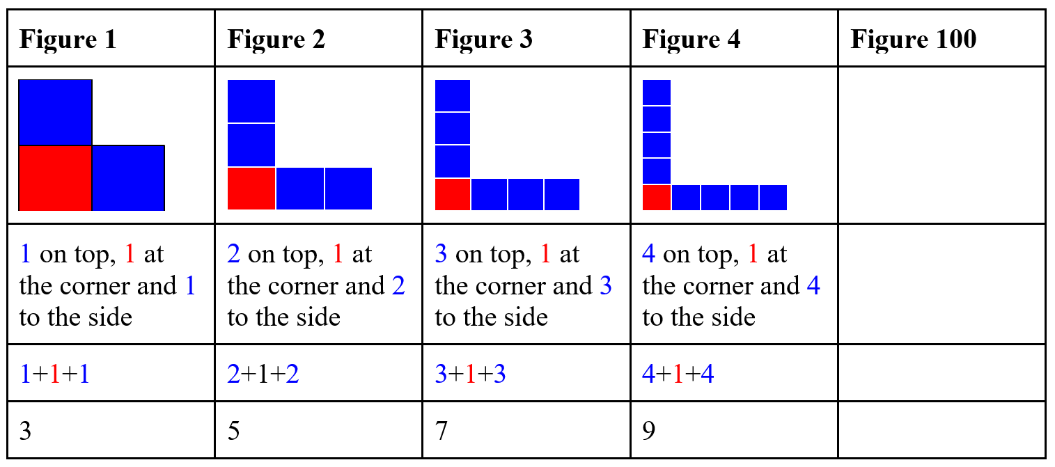
- Describe the first figure? The second? The third?
- Who can tell me how we would make the fourth figure?
- Predict and make the fifth figure.
- Describe the tenth figure.
- How many tiles will we need for the tenth figure?
- Underneath the pattern write a description for the 100th figure
3. Summing up
Encourage children to reflect on their learning:
- What follow up investigations would you like to do based on your findings?
- What surprised you most from what you learnt in this lesson?
Next Steps
Follow-on lesson:
- Children can use https://www.meta-chart.com/ to create a graph combining the data they have selected.
- Children can then insert this graph into Google Slides. They will identify what they have learned after comparing and contrasting the stats from their own local area with other areas of Ireland. They may wish to hypothesise reasons for any similarities or differences.
- Children can present their slides to show graphs & share their ideas and possible further questions with the class.
- Other pupils will be encouraged to listen and consider if they agree with what those who are presenting have said. They will be encouraged to add or build on what others have said. Those listening may also think of follow up questions that may be asked.
- Anticipate that children will describe the pattern structure very informally, and prepare to re-voice clearly for all children.
Display figures and ask whether they could fit in the pattern. What figure would they be?
For L-pattern: what figure would be made up of 21 tiles? 41 files?
How could we keep track of what’s going on and see how many tiles we need for each letter? Draw a table on the whiteboard: